


If you’re just getting started with Google Looker Studio, you’ve probably experienced blank-page syndrome.
You get your data source connected, open up a new file, and you have no idea what to do next.
There are no instructions. No guide rails. Just you and an empty page to fill.
And while you can start with a template (Google Looker Studio Report Gallery has several), it’s still tough to know how to customize it to perfectly fit your needs.
Here are some tried-and-true elements to include in PPC dashboards and reports that will banish blank-page syndrome and give your stakeholders the insights they crave.
1. Titles, subheads and context
When you add a chart in Google Looker Studio, you select the data source, dimensions, metrics and date range from the Data Panel to populate your visualization.
But your reader doesn’t see the Data Panel and won’t know what your chart is about unless you take an extra step to include it in your dashboard.
The two graphs below show identical data visualizations. Figure A includes only the chart, while Figure B includes written titles and context.
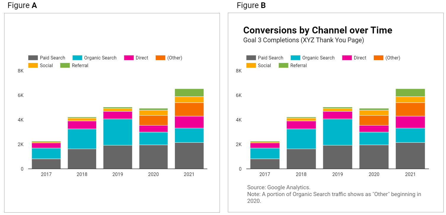
Figure A leaves questions in your reader’s mind that Figure B answers.
You can make your graphs and tables easier to understand at a glance with these tips:
- Give your data visualizations a title.
- Use subheadings and microcopy for additional context.
- Use legends.
- State the date range if it’s not included in the chart. (Note: “auto” date range defaults to last 28 days.)
- If multiple data sources are used throughout your dashboard, clarify which is used in specific charts.
How to do it:
- Add a text box and write out your titles and descriptions.
- This will open up a “Text Properties” panel to edit fonts, text size, and styling elements.
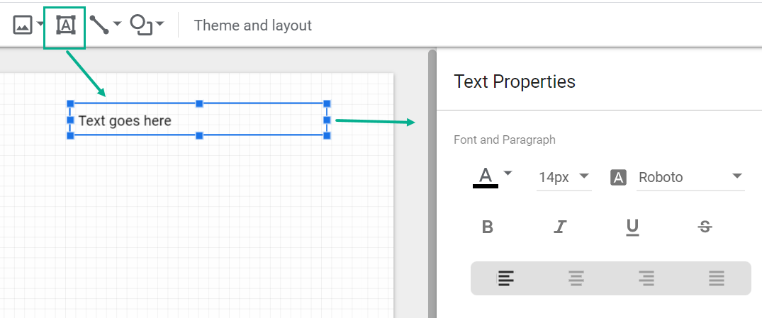
It’s worth the small manual effort it takes to add a text box and include context!
2. KPI scorecards
You don’t need an article to tell you that your dashboard should include your key performance indicators (KPIs).
But while you’re planning out your dashboard, pay special attention to where to include them.
Your KPIs matter most in your report and deserve top billing.
That means showcasing your KPIs with scorecards like so:

Not as afterthoughts at the end of a table:
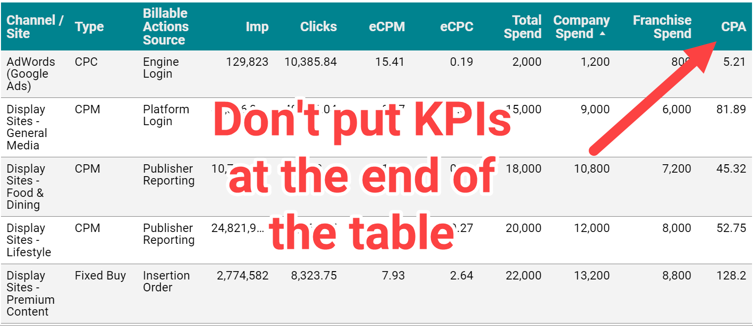
Not only do tables make it hard to identify KPIs, for languages that are read left to right, tucking KPIs on the far right of the table tells your reader these metrics are low priority.
Keep your reader focused on your key growth metrics like lead volume, revenue, or return on ad spend (ROAS), rather than vanity and traffic metrics like impressions and clicks.
How to do it:
- Use Chart > Scorecard.
- In the “metric” section of the Data Panel, add your KPI. Repeat as needed.
- Control format and size in the Style Panel.
Having KPIs appear in tables and other charts isn’t a problem, but give them added attention by using scorecards.
3. Goal pacing
Some advertisers use fixed monthly or annual marketing budgets with no room for adjustments.
Others have sales or efficiency goals they need to hit with flexible budgets.
No matter what the approach, your dashboard should answer the question:
Are we meeting our objectives, and how do we know?

Account objectives aren’t standardized, and neither is the approach for including goal pacing in your dashboard.
Fortunately, Looker Studio gives you many options for adding objectives and pacing, from literally charting against a goal to adding a written description of the target.
Here are some examples of how you might anchor performance to a goal:

How to do it:
- Option: Add a header that states the objective
- Option: Use a pacing chart such as bullet or gauge
- Option: Add a calculated field with progress to goal (metric/target)
Including goal pacing gives your reader confidence in how to interpret performance data.
4. Trends and historical comparisons
Trends and historical comparisons let your reader know if things are improving – or need improvement – over time.
Maybe you fell short of the goal, but you always miss it because it’s unrealistic.
Maybe you hit your goal, but you’re down compared to last year, and you need to take corrective action.
Don’t make your reader wonder whether current performance is average, down or “best month ever.”
Snapshot (single-metric) comparisons
Tables and scorecards give you an easy way to show your reader how performance for this period compares to another, using color-coded arrows to indicate the direction of the change (delta).
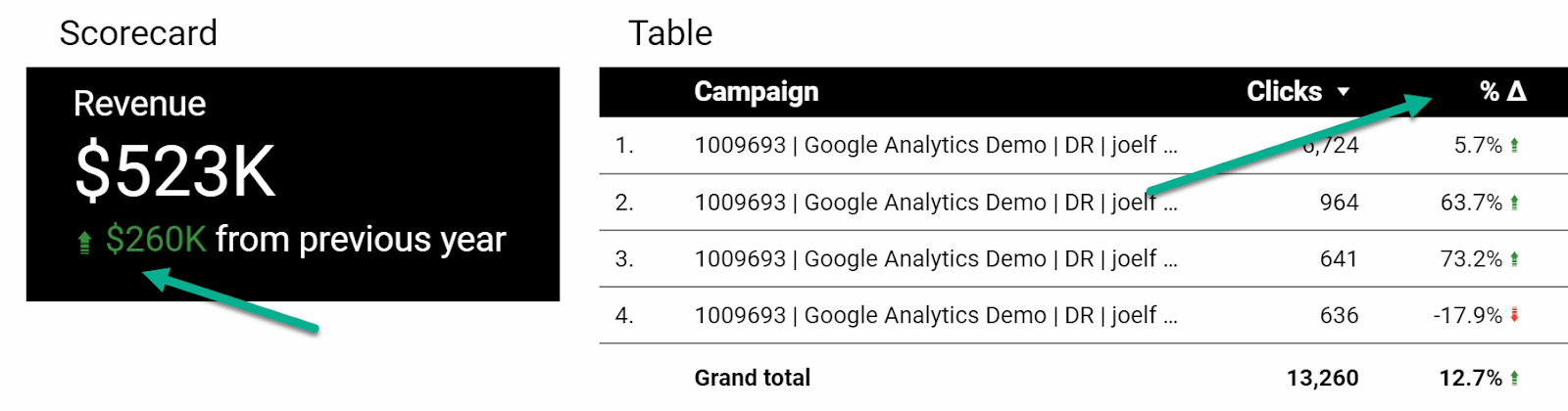
How to do it:
- Under “Date range,” select your comparison date range:
- Fixed
- Previous period
- Previous year
- Advanced
- In the Style Panel:
- Control the color of positive or negative change arrows
- For Scorecards only, you can select whether to show absolute or percentage change and whether to include a description of the previous time period (comparison label).
- You can also format Scorecards to show both YoY and MoM comparisons.
Line charts
You can get a complete picture of performance trends using time series charts.
Rather than just comparing this period to the last period, you’ve got an entire history revealing trends in seasonality, market impact and more.
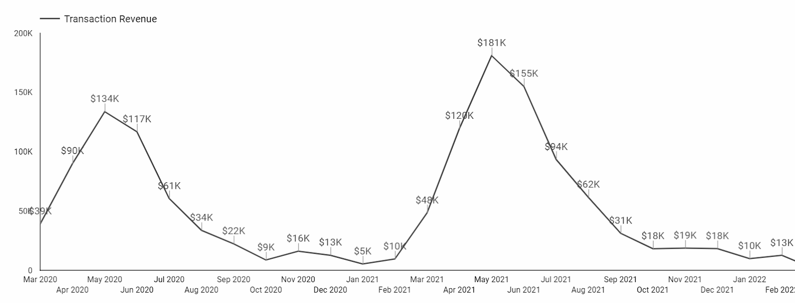
You can use a continuous Time series chart (shown above) or designate a comparison time period.
Here’s how that same data looks as a Year over Year (YoY) Time series chart. Note that the comparison year will show as a lighter shade of this period’s line:
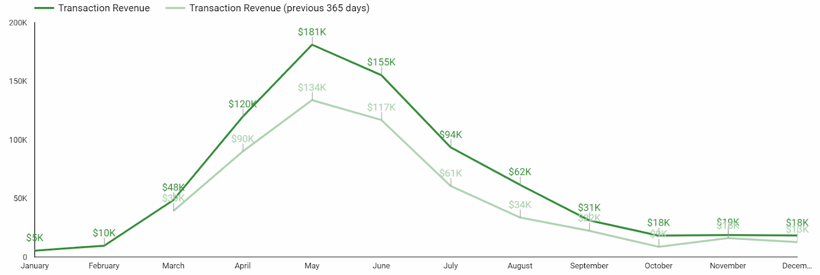
Another way to show historical performance is with a line chart that uses a time period as a breakdown dimension.
This Line chart is from a report comparing CPCs before and during the Covid-19 pandemic:
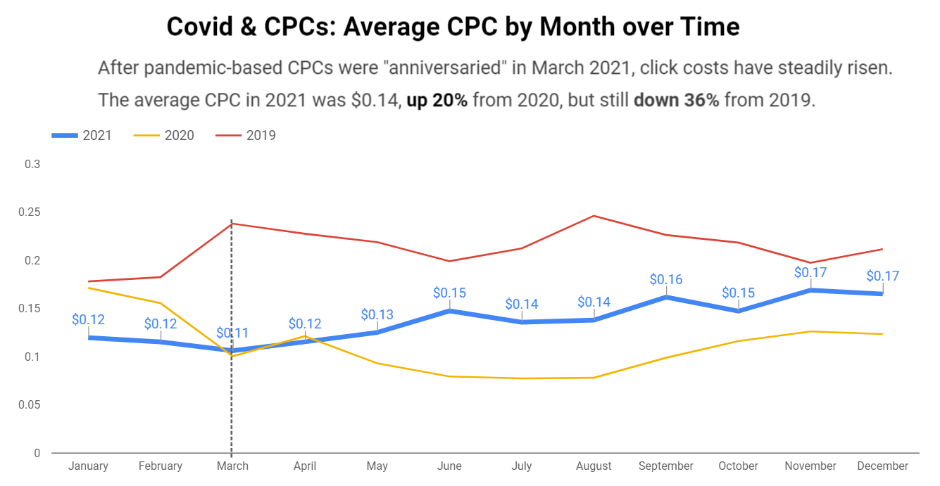
How to do it:
- To compare two time periods: Use a Time series chart and select a comparison date range.
- To compare three or more time periods (shown here for years):
- Select a Line chart
- Set the “Dimension” to Month
- Set the “Breakdown Dimension” to Year
- Set the “Sort” to Month
- Set the “Secondary sort” to Year
A few important notes for trends and historical comparisons –
- Only use these for your KPIs or metrics that directly contribute to your KPIs. Don’t add a CTR trend chart just for the sake of including a trend chart.
- There’s almost never a reason to show daily granularity in these charts. Zoomed in that closely, you’ll miss the signal for the day-to-day noise. Look for trends at a monthly level.
5. Categorical tables
Okay, so tables aren’t that glamorous.
But if your Looker Studio dashboard doesn’t have a table, something’s probably missing.
Why? Because there are times when your audience needs to compare multiple categories across multiple metrics. And nothing does that more efficiently than a table.
Tables are great for comparing default categories like:
- Campaigns
- Ad groups
- Keywords
- Search terms
- Final URLs
And depending on the complexity of your PPC dashboard, you can create tables for:
- Engines and platforms
- Channels and networks
- Funnels / intent / stages of awareness
- Brand vs. nonbrand
- Pivots of time segments, conversion types, and other categories
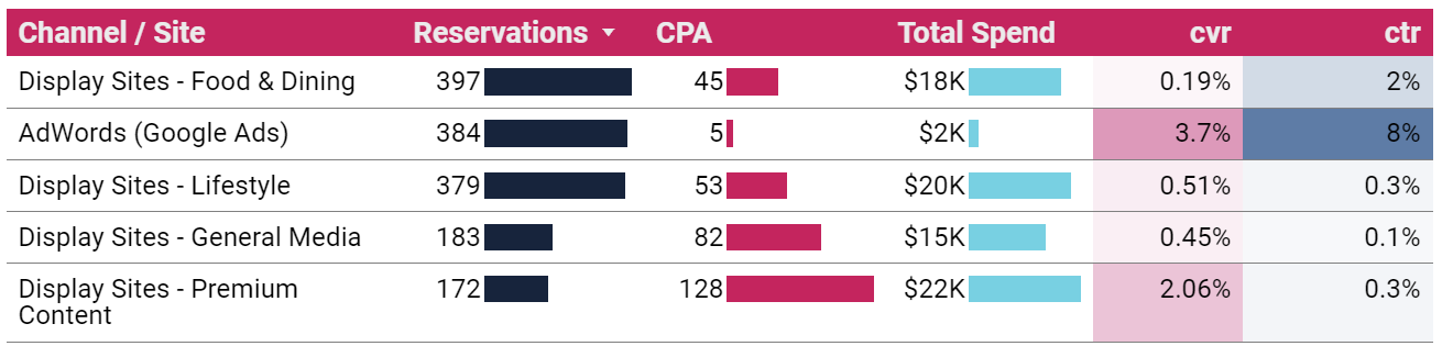
How to do it:
- Chart > Table (or Pivot table)
- Dimension(s): the category or categories you want to compare
- Metrics: your KPIs and supporting metrics
- From the Style Panel, you can format your table to include heatmaps, bars and targets
It’s easy to build tables and add metrics, and it’s easy to get carried away. Exercise some restraint and limit the number of metrics in your table, so it remains useful to your reader.
Bonus: Shiny charts
Our list constrained us to five categories, but here’s one bonus for making it to the end:
Shiny charts.
What are shiny charts?
Shiny charts are visualizations that your audience loves and gets excited about, even if they’re not super actionable.
Your readers may not learn anything new, but they’ll feel like they learned something new.
Maps are a great example.

Many dataviz experts say not to use map charts; there are better ways to communicate location data.
But try to find a client or stakeholder who doesn’t love to see performance data on a map. Go ahead. I’ll wait.
Sure it’s a bit counterintuitive when you’re trying to build out an actionable dashboard. Maybe even a bit controversial. And you don’t have to do it. But a chart that makes your audience feel good just for seeing it has its own merit.
Putting it all together
While your Looker Studio dashboard can technically include whatever you want, it should at a minimum include:
- Title and context
- KPI scorecards
- Goal pacing
- Historical comparisons
- Categorical tables
These don’t need to (and can’t) all be discrete sections. One scorecard can include a title, KPI, pacing, and time comparison.
There are many other charts and visualizations that can take your PPC dashboard from good to great. Getting started with this list will set you up for success and give you a dashboard worth the time it took to build.
Opinions expressed in this article are those of the guest author and not necessarily Search Engine Land. Staff authors are listed here.
Related Stories
New on Search Engine Land
About The Author

Amy Hebdon is a Google Ads conversion expert and the founder and managing director of the Google Partner agency Paid Search Magic. Since 2004, she’s managed Google Ads for clients ranging from Fortune 10 to SMBs at agencies, in-house, and freelancing. Her articles have been published in Search Engine Journal, Unbounce, PPC Hero, Supermetrics, Copy Hackers and CXL. Together with her husband James, she also runs the Facebook group Google Ads for Savvy Digital Marketers.

